Tuesday, 22 August 2017

22/08/2017 - Final show

We have just 2 weeks for final show, so we needed to finish some preparations for our website uploading. I could not finish my artist statement, because it was really difficult and confusing to me.
thus, my tutor helped me and I corrected my artist statement.
I also wrote down about my study experience and what I have learnt in LIPC in DMU.
I tried to introduce myself and my thought rather than my works. 
Finally, my tutor checked mine and I uploaded on Google plus for website.


"I am a contour designer and my designs are based on gender identity. I am interested in the gender roles by exploring the common factors which both genders can share in depth to create new unique style. These days, unisex design is an emerging trend in the world of fashion and there are also many gender neutral brands and labels, such as ‘One DNA’ and ‘Too Good’. Their designs changed my perception about the gender identity by providing the same design for both genders.
Moreover, ‘Too Good’ has seven collections and each has different theme, which is simple and distinctive, and they have expressed the classical and contemporary simplicity through clothing. Many people may think each gender has to wear different clothing in the aspects of size, function and roles. However, I think they can share all of those with just different cut. Thus, I want to design male underwear and female lingerie in gender neutral design.
I like working with various kinds of fabrics such as silk, lace and chiffon. Thus, I am looking forward to exploring new fabrics that I have not used before for my designs and new materials which can be merged with the lingerie.

I have developed many skills, such as different types of drawing, digital skills, portfolio and sketchbook work. Furthermore, I am looking forward to beginning my Contour Design Degree in October in DMU."


This is my artist statement.

Tuesday, 15 August 2017

15/08/2017 - Final Show

I presented the progress of SNS promotion.
We have 19 followers until now. I think we need to attract more people to introduce our show and pages by sharing the posts that I have uploaded on Facebook.


This post is one of the best attractive posts on our page.
225 people saw this poster!!


Thursday, 10 August 2017

10/08/2017 - Final Show

My tutor stated about our team work. Thus, we talked together about how to attract followers' interest. I usually enjoy others' photos, funny video and useful information or tips on SNS. 
If we also make some interesting contents, such as images and videos, we will get more followers.

Today, I also uploaded our flags and information.


I always consider and decide the contents of our posting together and we are following the plan order.
It was easy to manage the SNS pages due to the specific plans. 
I want to gather more 


Tuesday, 8 August 2017

08/08/2017 - Final show

We talked about our forward plan and I started my work on Facebook.
I uploaded three posts and wrote down explanation about the posts.


This is the first post which is our logo. I explained about ourselves.


the second post is our group poster. I wrote down about the meaning of 'Artifex'.

 The third one is SNS poster. I also put the '4 WEEKS LEFT' to let people know the time flowing.

And then, I edited Facebook page information part. I added our Email address and description.


Thus, all preparations finished and we (SNS team) just need to manage it and upload our art works.
I think we also have really significant role because we can contact with other people. I need to consider how to promote our pages as widely as possible.

Thursday, 3 August 2017

03/08/2017 - Final show

Finally, we decided our logo and I made the SNS poster for Facebook.
I put our logo, slogan, location and the date on SNS poster.

This is our main Logo.


This is Facebook poster designed by myself.

This was designed as Instagram poster by Luke.

This was designed as Snapchat poster by Aldana.


We chose one design among these posters to make unity, so we discussed and chose Facebook poster.
I will upload this poster every week on Facebook to let people know the time flowing. We also talked about our interview that will be uploaded on SNS pages to introduce our art works.


Tuesday, 1 August 2017

01/08/2017 - Group meeting

Today, we checked our state of progress for final show.
I am SNS team, so I showed our SNS pages and what I uploaded until now.
There were some problems, such as music right problem that we used at video clip. Moreover, I also need to change our SNS poster because we changed the font that we have used in the poster.
Thus, I will edit them and upload again. We wrote down the description about our SNS page.


We introduced about us.


We also looked at the strategy of SNS with our time table.


We also talked about the website and main poster.
Firstly, we discussed about the fonts, and decided the best one. We also decided what factors we are going to add on our website. we will put our images, artist statement and our video clip.


I will design the SNS poster again and then upload it tonight.

Tuesday, 25 July 2017

25/07/2017 - Final show

Our SNS team designed our poster for social network sites.
We will use three social sites, Facebook, Instagram and Snapchat.


I designed this one and showed to our classmates. My tutor pointed out if the heart image is related with our group theme. Frankly speaking, it is not necessary for our poster and website because there is nothing concerning the heart. others also agreed with tutor's opinion, thus, i have to change the poster.

Thursday, 20 July 2017

20/07/2017 - Final show

Today, we talked about splash page and we started making it. We divided to some groups and thought about the design of splash page. 
Firstly, we researched examples and how to make the neon sign image.
I thought about how to well express ourselves in this page. Our main theme is neon, thus, i used that effects on the page.


We considered the font and size at first and put some effects, and then, we also chose the slogan among the ideas that we have already collected.


Finally, we presented our final piece to our classmates and looked around others.
I think it is too simple so I need to put more attractive factors to express us.


Tuesday, 18 July 2017

18/07/2017 - Final show

We worked in each team, our SNS team discussed about our certain plans.
We chose how many posts we are going to upload a week. This plan is really important to manage our own pages and promote it.
  • Instagram : 2 ~ 3 times a week
  • Facebook : 2 ~ 3 times a week
  • Snapchat : Every final show class


  1. First post will be our logo.
  2. SNS poster
  3. Artifex poster
  4. each flag
  5. our personal photo & group photo
  6. our group works : we also decided the order to upload the works.

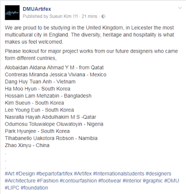
Our group email address is dmuartifex@gmail.com

Thursday, 13 July 2017

13/07/2017 - Mood Board

We needed to design a mood board in a group with our ideas which will be using for our final show theme. Firstly, we thought about the main theme and colour pallet.


Our team chose "Colours" as our main theme of virtual gallery. Thus, we thought about how to improve the idea and divided the team to make a mood board.


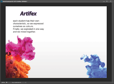
My team members are Luke, Young and me. We decided to express our possibility as a volcanic eruption. It means that each student has their own characteristic and style, however, we work together by cooperating and we finally burst in one group like volcano.


We started making the mood board after saving some images that would be using in our design board.


  • Images


Colour Pallet


Background Image


  • Making Process


  • Final image


We focused on expression of colour mixing, so we used quite many colours on the mood board.

Tuesday, 11 July 2017

11/07/2017 - Final show

Today, we discussed  about the main theme of our virtual gallery to start designing the websites and posters at first. It was difficult to combine the opinions and ideas of each person because each person has their own distinctive ideas.
Thus, we talked in groups that we have already chosen (SNS, Curating team). Then, we talked about the importance of "Typography" to promote ourselves, and then found some websites which are using "Serif", "Sans Serif" or "Script" fonts. Moreover, we discussed about the importance of font weight and size.

I think "Typography" is one of the most significant parts of promotion. When I look at the advertisement, I firstly concentrate on the letters written on the poster to be aware of the contents. Letters can attract people's eyes and make power. Therefore, we need to consider the fonts that we will use for our website carefully.

The image below shows the differences among 'script', 'serif' and 'sans serif' fonts.

I became aware of the differences between fonts and how it affects to the image of websites or posters. Many brands have their own logo by using particular font that can express themselves, so our group also need to choose one font for our group.

Tuesday, 4 July 2017

04/07/2017 - Final show

Today, we talked about our virtual gallery for final show. Firstly, we tested our team work which is the most important part for our project, and then we watched a video that is related with the test that we did.


Then, We needed to decide each part to divide the many roles. We considered which person can fulfil the works successfully, and chose the roles together. I have got 'Curating Team' and 'Social Media Team', because I always use the social media in ordinary life, so I am good at using the social media.


Therefore, I researched about the role of my teams that I chose to achieve it successfully.


  • Curating Team : a team that is in charge of selecting and caring for our works and objects to be shown or to form part of a collection of art or exhibition.

  • Social media Team : a team that advertises their products, investigates and collects the results, and communicates with consumers. It is necessary to plan the team structure.


Now, I need to think about my forward plans and what I can do for my works. This is group project, so I think I need to do my best, because it is not just my work. I will cooperate with my classmates. 

Thursday, 16 March 2017

Major Project - 10th design board (Final)


The 10th Design Board (Final)


I did not want to make this board complicatedly since the theme of the 10th room is 'Waiting and Longing', which are person's lonely emotion. Thus, I have looked for simple design board for my tenth design board.

example


  • Making process


I have changed the composition many times, and I found suitable lay-out finally.


  • The Tenth Design Board (Final)


Reflection; Finally, I have made 10 pieces of design board. When I designed the last design board, there was less burden than the first one. I learnt many important things concerning design and how to manage my own work and time. I also learnt how to express my meaning and show the each concept on the design board. I realized the importance of the plan. If I did my major project without any plan, I could not make 10 pieces and better final images.
 
I have to improve myself by practicing more and more in lay-out or color aspects. I became know what my weaknesses are in design. I will improve it and manage my time.
 
It was really delighting time to make my own design boards. I learnt what I can do the best!!


Reference
 

Major Project -10th work


10th Major Work


  • 10th room's theme : Waiting and longing
 
  • Mature men (50-60 years old)


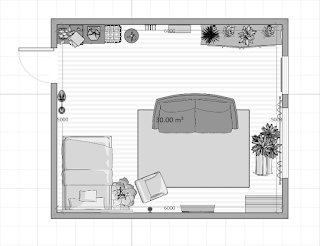
I have researched grandfathers' room for designing for mature men, and I found the fact that there was a clock in most images. When I looked at the clock, it looked lonely because maybe I can feel the flow of time by the big clock. Thus, I want to express the waiting and longing of old father as a room design.


  • Making process


⇩ 


⇩ 


⇩ 


⇩ 


  • The tenth work

Overall image
Right view

Front view

Left view

Back view


  (detail view)


Reflection; Actually, it was difficult to express an emotion as design. However, I could express it by using some products and changing the color of room. I recalled the research that I did before designing, which helped me consider how to show the emotion. I used a fireplace and big clock to express the waiting and longing. I also used the large sized windows and a sofa to show his loneliness. I think those play a roll well as expressing feeling.

During designing the room, I have learnt the relationship between our emotion and the atmosphere of the room and furniture. I also thought about myself by recalling my room design.


➥ Reference


- http://www.houzz.co.uk/