Tuesday, 21 February 2017

Feedback

Feedbacks for my Blog & Website


In Digital Art class, I introduced development progress situation of my blog and website in a small group to receive some feedbacks.

At the beginning, We received a feedback form paper to write down some comments for classmates who would introduce her or his sites.


the images below are Feedback Form that I received.


I also received 3 classmates' feedbacks.


From Robson


From Tolu


From Moohyun


Reflection


; I read others opinions about my sites after receiving the paper. I was delighted because others thought my blog positively and well-organized. I always focused on organizing my blog posts clearly in detailed process. So, many students recognized my pursuit.
However, I need to find other faults and have to improve it.


Monday, 20 February 2017

Major Project - 3rd design board (Final)

The 3rd Design Board (Final)


I tried to design the board in my own style.


  • Making process


I made new board at the first.


I wanted to use the leather texture image as the background of my design board.


I moved the image that I separated from the white background into the new board, using the guide line.


And then, I wrote down the title on the top.


However, after putting an image, I thought that using the leather image as just the title background would be better to show my design factors, so I changed the size to fit it on the top and moved the image.


I found some mannequin images to use on my design board because the 3rd  room's main factor is mannequin for the dressing room.
Thus, I wanted to use this image to express it.


I put the mannequin image into the board.

 
I also added color palette to show the colors that I used for designing the room.


  • The Third Design Board (Final)


Reflection; I want to design all of the design board differently, so it was difficult to find different style form from previous design boards. I think I have to improve the skill to arrange the images in various views, because I considered the location of images many times while designing this board. If I find another arrangement, I will try to change it to show the images more effectively. I am satisfied with the mannequins which are the main point of this design board and striking on the board. I wanted to put more information and extra factors, however, I thought if I put those, this board will be discursive. Thus, I just kept the design.


Reference


- https://wallpapersafari.com/leather-desktop-wallpaper/ (leather image)
- https://www.mannequinmadness.com/products/female-french-dress-form-black-jersey-with-chrome-wheeled-base (mannequin image)

Major Project - 3rd work


3rd Major Work

 
  • 3rd room's theme: A fancy Ballroom
 
  • Young adult women (20-29 years old)
 
 When I think about a woman in her twenties (like me), she may love enjoying parties, clubs and so on. I think 'Twenty' is the most beautiful moment in my life. I can hang out all night with friends and someone who met in a club or a party. Although there are many different women who have different tendency, I think almost will want to enjoy their twenty splendidly. So I determined to design a room which look like a ballroom to express their splendor. I will design two parts in a room, a bed room and a dressing and cosmetic room. women start being interested in the cosmetic and fashion in earnest in their twenties.


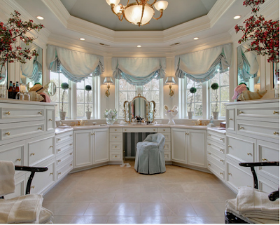
I found some dressing rooms for my interior design for twenty women. I wanted to focus on the dressing room because a fancy dressing room is always roman of women.


  • Making Process


This room built on Black color because I think Black can express the grace and exclusivity of a ballroom. I add Red color as a point color.


I put some main furniture, dividing the rooms to two parts, a bed room and a dressing room.


  • The third work
 
Overall image
 
Right view
 
Front view
 
Left view
 
Back view
 
 (detail view)
 
 
Bed Room

Dressing Room


Reflection; I spent the longest time designing this room because maybe I am also a twenty woman, I am also interested in cosmetics, clothes and so on. While designing the room, I tried to be careful to put my taste in this room. The dressing room is my favorite part among rooms that I designed before. Actually, I really love Black color since I think it can express most moods and features, such as loneliness, grace, refinedness, calm and my own world. I will design my own room later by using the Black color.


➥ Reference


- http://fromluxewithlove.com/june-makeup-favourites/
- http://www.houzz.co.uk/

Major Project - 2nd design board (Final)


The 2nd Design Board (Final)


I want to design 10 design board which have different concept. Thus, I researched some examples of design board which are different from the first design board style at the beginning.


example 1


example 2


  • Making process


Beginning is the same with the previous process making a new board.

I extracted the design image from the background.
 
And I put the images on the new board.


I wrote the title under the images.

I used a brush tool to draw lines.
I changed the style of the brush because I want to use dots and I also
used the 'Grid tool' to make me draw the line more easily.


  • The Second Design Board (Final)


I changed the title of the mood board because my tutor pointed out the title. It became better to recognize my concept of  the project after changing the title.
My title makes the room be more focused on the color which is my main concept!


Reflection; I think this design board looks like more design board than previous it. I focused on the construction of the board, so I am satisfied the composition, however, I feel the lack of the texts in this board. I realized it after composing the images, so there is no enough space to put the text. I will improve the problem in the next work by making a more systematic design plan. I learnt how I can manage the order of designing by designing this design board and I will show better works after this learning.


Reference


- https://essaypro.com/gb/?tap_s=Kx5Y6fjzati4f6khwBet9B (examples)