Tuesday, 31 January 2017

Major Project - Initial ideas


Initial ideas about Major Project


Firstly, I have considered the subject of my major project, so I thought out three concepts for my project. I needed to choose one among these.


Idea① : By country classification
 
  • I want to divide the room designs by country, such as traditional interior of Japan, Korea, the UK and so on.
  • I think there are  distinguishing factors in each country.
  • For example, a Japanese floor mat, fireplace, carpet and so on.
 
Idea② : By natural phenomenon
 
  • There are much natural phenomenon, for example, drought, tsunami and thunderbolt.
  • I also want to combine with the characters of climate, such as tropical  rain forest(an Amazon), oceanic climate and temperate climate.
  • I will design 10 different rooms by using those image into the wallpaper or fabric.
 
Idea③ : By age & gender classification
 
  • I divided the age to 5 classifications
  • I will make 5 different girls & women rooms by age and 5 different boys & men rooms by age.
  • There are many different things for different age and gender, so I thought if I made distinctive rooms for these people, it would be interesting try and I could make  practical interior designs.
  • classification
         (5~8years old)
         (9~19years old)
         (20~30years old)
         (30~50 years old)
         (older than 50years old)


I chose the last idea because I thought if I choose this concept, I can make more wide and pragmatic interior designs for people who want to live their own suitable rooms.
 I will keep on making the process after making specific plans and ideas.


Friday, 27 January 2017

MOOD BOARD


MOOD BOARD


I was heard about MOOD BOARD and saw some examples at the first.
I tried to make my own MOOD BOARD in Digital Art class using 'Photoshop'.

My subject of mood board is Gender & Age Tradition. I want to express the difference among girls, boys, men and women by age, so I used some particular images to express it.
For example, I used toys which meant young boys (5-8 years old), mirror that meant young women who want to improve their appearance by looking the mirror everyday.


young boys' room                                              adult men's clothing room


                    young women's room                                                 old women's rest area


Process

 
  • Firstly, I made a new board in A4 size.
 
 
  •  I put some images which are concerning my major project on the background. I used 'guides' function to see the arrangement of images more easily.


  • I put the title of my mood board and my name on my board after putting all images.
 
 
 ⇣


  • My MOOD BOARD


Reflection; I have not made a mood board before, so I thought it would be difficult at the first.
However, I made it successfully by doing step by step, using useful tools in Photoshop. Although it was quite difficult to arrange the images, I learnt how to improve myself by trying many times.


Saturday, 21 January 2017

Advertise project


Advertisement


We received an assignment about creating an advertisement concerning our progression route. My team consists of students who will major in interior design.
Team members are Hayah, Aldana, Jessica and me (Sueun).

  • Firstly, we thought how atmosphere of house could be changed and what made the mood of a room comfortably. there are many factors which make the room atmosphere, such as wallpaper, fabrics, curtain and so on. Especially, We thought the curtain played an important role in the interior mood and for private place for people's life in their home.
there are many kinds of curtains with different colors, styles and so on and also people choose various curtain designs to decorate their own space.


  • We also thought about targets of our advert. There were two choice, commercial object or domestic object.
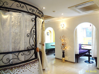
We chose commercial purpose for our advert, because I wanted people to see our curtain in the familiar places like a café. So, we chose the café as our advertisement place, since there are many coffee shops(café) around us and many people enjoy tee or coffee time in the café, which is the most familiar place these days.

I think interior has to be designed in accordance with the suitable ambience.
People go to the café to take a rest in the comfortable place with coffee, so many cafés are designed with stable ambience and calm songs are usually played in the café.
We decided to put the appropriate curtain at a café into our advertisement. Our consumers will be someone who want to found their stores or any places.


Actually, room style café is becoming popular in my country because some people want to find their private place for meeting, studying and dating. I also went to the room cafes frequently, so I got inspiration from these separate rooms using the curtain.


  • We found some examples of advert and poster, since it is the first time to make our own advertisement. We used www.canva.com to refer it to our advert, which is free online templates software .


➜ 1➔ 2

I found two types of templates. I think the first one is good at expressing the curtain shape, and the second one can express the curtain mood. I want to show the balance of the curtain and the ambience in our advert. I thought the first one was better than the second poster to express some situation, so I chose the first poster.


  • This is our idea sketch for our poster. We made two types as horizontal and vertical, and then we decided the second idea because vertical curtain looked more suitable to show both things, the café and the curtain.


  • Photoshop process
: We took the curtain photos and café photos separately, so we needed to combine them.

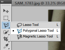
Firstly, I cut the curtain shape to separate it from background using 'Polygonal Lasso Tool'.


I moved the curtain image to the other background(café image).

In sequence, I wanted to adjust the curtain image to mix naturally with the background image, so I used the 'Color Balance', which is adjustment function.

  • The image below is the mid-process which is not put logo and slogan yet.


  • I tried to find some curtain brands which feel comfortable to put their logo into our advert. There were many brands and they have each feature, such as fancy pattern. However, I wanted to find a brand that have many kinds of curtains which people can use to decorate everywhere. 


I chose a brand which called 'BAZAAR'.This is Korean brand and they mentioned that their logo expresses 'Humanism of the digital era' and also involves human emotions with nature on their page.
The reason why I chose this brand is their meaning of the brand goes with the café, because many people enjoy their time with various digital device in the café. Although café is not nature, we can feel comfortable like as nature in the café.


Firstly, I downloaded the image below from their page and I wanted to use just the logo.

I cut the logo from the background like previous process(curtain shape) and then I moved it to previous advert background.


However, it is difficult to look the logo, so I put a effect which called 'Stroke' to make it easy to find.


After putting the effect, I changed the shape of the logo to show it like being on the wall using 'Strew' in 'Transform' function.


  • Finally, we had to decide our slogan.
"Start your SHOW time" is our slogan.
I made it because the curtain which is in our advert poster looks a show curtain that is used at a show or a musical. It means that people can decorate everywhere they want and start making their new place by using our curtain and also the curtain means people's private space by separating from outside.

I used 'Horizontal Type Tool' to write our slogan and then used 'Strew' again to change the shape of the slogan as the wall.


 ⇣


  • Final advertisement image


Reflection; While making our own advertisement, I felt it was really difficult task. When I put some idea on my advert, there had to be the reason why I put it and I also should consider if people can understand my poster without any explanation. I tried to put my idea as the combined image and I want people to understand our poster easily. It was quite hard assignment, I learned how can I make a advert step-by-step and how logos and slogans are important.


Reference


- http://oakbaybeachhotel.com/dining/kates-cafe/ (café image1)
- http://runforthehillslondon.com/portfolio/artisan-coffee-shop/ (café image2)
- http://www.topdreamer.com/20-modern-living-room-curtains-design/ (curtain image1)
- http://www.architectureartdesigns.com/17-delightful-autumn-interior-designs-that-will-steal-the-show/ (curtain image2)
- http://decorationchannel.com/living-room/living-room-curtains-ideas/ (curtain image3)
- www.canva.com (templates)


Tuesday, 17 January 2017

My blog buddy


My blog buddy


She is my blog buddy.
Her name is Minji.

I will check her blog and leave some comments for her blog and also she will do it.
we will exchange each ideas and help each other.

Sunday, 15 January 2017

Personal Sequential Image


My Sequential Image


<personal activity>


Title : Bad eating habits of modern people
Subtitle : Excessive dieting
why : I want to express wrong thought of modern people, such as lookism, mammonism and so on. These days, many people want to be more thin and beautiful than others, so they tend to eat nothing but they do not work out and go out. People ate healthy food by taking various nutrient, such as beef, vegetables and everything in times past. Moreover, they enjoyed playing out of door and did not eat snacks frequently. On the other hand, nowadays, people just stay home and enjoy snacks like chocolate and candy as there staple. Modern people are being plump and feeble with wrong thought.


<final image>


The first image = people in the past (healthy)
The last image = modern people (too fat or too thin)

* Take a close look at the differences among images *


  • plan

        : Firstly, I draw my plan on the note.


People in the past ate food more healthily than now,

however, they were more healthy and skinny. 


  • material preparation
        : I bought some ingredients, such as beef, vegetables, chocolate and so on because my subject is body of people by food and then I made some food according to my plan.  


  • how to make the image
        : Firstly, I used the mobile phone camera and I did not use any effect on the images. I used 'Adobe photoshop program' because I wanted to make my wrist thick and thin to express weight change by food change. 
I used [Filter] - [Liquify] - [Bloat Tool] and [Pucker Tool] to extend and reduce my wrist and I combined the images using the same program by making a wide page.


Reflection
 
 
: while making this image, I thought about the modern problems. If I have opportunities to make some works which is concerning the social problems, I want to make it more concretely. I concentrated on making it because it was really interesting to me. I will take sequential images in ordinary day since I think it is useful to record everyday.


Group Sequential Image


 Group sequential images


<team activity>

  • Team members : Aldana, Yuna and Sueun
  • Why : We are women who are interested in make-up and styling, which is the reason why we chose make-up process as our subject of sequential images.


Firstly, we had to choose a model who would take the photos, so I volunteered for the model because I wanted to see my changing process. We classified the process into 6 steps. The first image expresses shower scene and the final image is my perfect final face.

To make the sequential images, I took a shower and took a bathroom picture because it was impossible to take my shower scene. I did base make-up using foundation or BB cream in the second scene and I did eye make-up. I ranged my hair and wore clothes after lips.

I took photos of all processes by myself using my mobile phone camera while I was making up and then I chose an image in each step. Finally, I combined the pictures into one page using a mobile phone application called 'PicsArt'


 Reflection
 
 
: I was funny and felt as if I became a beauty blogger while making this image below. On the other hand, it was difficult to take photos from a same angle but I could manipulate photos by using the application. I think this image below can be a realistic image that many women can sympathize the process.
I also learnt that there are many sequences in our ordinary day, so it was really related our life.


Friday, 13 January 2017

Artist Research2


Artist Research2

 
  • Duane Michals


Duane Michals is an American photographer who creates narratives within a series, blending image with text in a format like cinematic sequences.
He received a BA from the University of Denver in 1953 and worked as a graphic designer until his involvement with photography in the late 1950s.
He first made significant, creative strides in the field of photography during the 1960s and manipulated the medium to communicate narratives.


When I researched him, I surprised at his various photograph style. Some images were really simple and calm, on the other hand, some images were quite fancy using different materials. I like both styles of his works.


Empty New York - Duane Michals, 1964


Marlene Dietrich - Duane Michals, 2014


Dr.heisenberg's Magic Mirror - Duane Michals, 1998


↳ Actually, I saw this sequential image for the first time in digital art class. I tried to guess the meaning of this image, however, it was quite difficult to understand.
I can see a woman who are looking the mirror and a big mirror which is reflecting her strangely. I thought the reflection that is in the mirror expresses the part of her face which she wants to cure. I like this image because I always look in the mirror, so it looks like me.


This image is an everyday photograph in the toilet. It was familiar to me because it is the outgo preparation process of most people including me. The reason I chose this image to introduce on my blog is that it is difficult to express implicitly, although it means just one process by using a material.


"Michals repeatedly emphasizes the importance of capturing not the appearance of a situation, but the experience."

 
⇢ When I saw this sentence in a web page(http://adcglobal.org/hall-of-fame/duane-michals/), I realized the importance of experience. Experience of all part will be helpful for my life later. Actually, I also like his works, I really respect his mind.


➥ Reference


Thursday, 12 January 2017

Artist Research


Artist Research


  • Elliot Erwitt


He was born in Paris in 1928 and stayed in many countries, such as Milan, United State, New York and so on. He is an American advertising and documentary photographer known for his black and white candid shots within everyday settings. While researching on this photographer, I saw many interesting black-and-white pictures which took by him and his simple photography. There are many photographs which children and dogs are appeared, which means he loved them.


when I saw his works, it was interesting to find hidden meaning in the pictures. There are also images which have funny story and meaning that people can understand easily, which is the reason I chose this artist for my research. Sometimes, it is so difficult to understand thought of artists when I see their works. However, Elliot Erwitt included meaning that people can guess joyfully. In his photographs, there are usually one or two figures. Although it looks quite simple, I feel it is full images because I can make various meanings by supposing his thought. There are some photographs that fascinated me.


For example, when I saw the first picture below, I just thought it expressed wind and then I tried to think deeper by making the story. there are two people and some chairs. In the second image, people disappeared and I can see the wind flow by changed shape of the chairs. Finally, I thought it meant freedom and their comfortable mind by expressing the wind flow.


beach chairs - Elliott Erwitt, 1975


The next photograph is funny and easy to understand the situation, which is why it is my favorite image among his works. There are a person who looks like a owner of the dog and a dog near the water. Although it has just three images, I can infer interesting story. A man is throwing a branch to the water, however, he disappeared with the branch into the water and the dog is looking that way. Actually, I do not know if he fall into the water, I just guessed the situation.


Sequentially yours-Film's not dead - Elliott Erwitt


I thought the last image was a composed image at the first, however, it is not a manipulated photography. I usually saw candid and natural pictures while looking for his works and there are also two dogs in this image below.


New York - Elliott Erwitt, 2000


I think there is not a special feature in his photos, however, I feel comfortable when I see his photographs motionlessly. I think the features that it is black and white photography and composition makes the images more ordinary and monotonously. He also put the subtle emotion into his photography, such as eyes of someone, expression, perturbation and so on. I like these factors that I can know when I observe it carefully, which make me be addicted to his photos. 


Reference

- https://en.wikipedia.org/wiki/Elliott_Erwitt
- http://www.elliotterwitt.com/lang/en/index.html